Modernizing Craigslist UI in order to enhance the current user experience.
Team
Arlety, Demi, Jerry, John
Duration
1 Week Design Sprint
Tools
Figma, FigJam, Photoshop

👉 Overview 👈
Craigslist is an American based website home to classified advertisements where users are able to find for sale items, housing, jobs, services, items wanted, community services, gigs, resumes, and discussion forums. Despite the useful nature of the site, it has faced a lot of criticism over the years due to its unchanging user interface that makes it difficult for users to find information.
As part of a product design challenge my team members and I worked collaboratively to redesign the current platform in order to better enhance the user experience and optimize the users goals.
Problem
Craigslist's outdated design and lack of modern features have resulted in a poor user experience, risking the platform's relevance in the online classifieds market. A redesign is needed to maintain its position as a leader in the space.
Goal
The goal of the redesign is to create a modern, user-friendly platform while maintaining the simplicity and accessibility that that maintains the simplicity and accessibility that Craigslist is known for.

Research
Research
Desk researchAbout the platform
Before starting the redesign process our team went ahead and did some secondary research to learn about the website, its functions, and demographic. After reviewing following insights were discovered

data gathered on craigslist
“There are many fake ads on Craig’s List, which deters some people from looking for a job on there. There tends to be more scamming and spam.”
Craigslist features
01
User demographic is made up of primarily male aged 25-34 originating from the United States.
02
The typical craigslist user's goal is to search for their desired service or product.
03
Users are limited to one ad post per category and city every 48 hours.
Competitive AUDITCraigslist’s competitors
Once we knew a little bit more about the platform we did some research on Craigslist’s competitors. After studying their competitor we found that a majority of them required accounts in order to purchase or list items. This was something that Craigslist was addressing and made the listing process easy to use.
A majority of the competitors although they had great UI there were certain things that Craigslist address better, more specifically the simplicity of the user journey.


Because of our team's time constraint we relied on user reviews posted on sites like Trustpilot to better understand exactly what Craigslist users think and feel.
Key findings
01
Difficulty verifying legitimacy of ad postings causing users to be skeptical and result in being deterred from using the platform.
02
Straightforward UI design helped users quickly find what they were looking for
03
Many users expressed feeling satisfied with the current features offered on Craigslist like the ease of access when it came to publishing an ad
research insightsRethinking our strategy
After analyzing the data from the forums our team decided to scrap our original idea to completely redesign the app. Instead we focused on understanding the current user flow and seeing if there were any potential gaps or opportunities.

data gathered on search results for craigslist users
Design Goals
Design Goals
key insightsWith the initial research in mind we wanted to emphasize some things
It’s important to avoid cluttering the website with unnecessary elements to ensure easy navigation and fast loading times.
With a majority of users wanting to go in and out of the website, it's crucial that we limit the amount of clicking they have to do.
By modernizing the current UI we are able to make users feel more confident about the product and in return want to continue coming back to use the site

empathy map of typical craigslist user
User flow
We created a user flow diagram to map out the steps of the user taken.

"As a user I want to be able to browse and contact sellers on Craigslist"
Design Exploration
Design Exploration
Typically our team would begin by sketching out some ideas but because of the short time constraint we went straight into wireframing.
wireframesMore changes
Previously we wanted to completely change the home screen by giving user a top navigation bar.
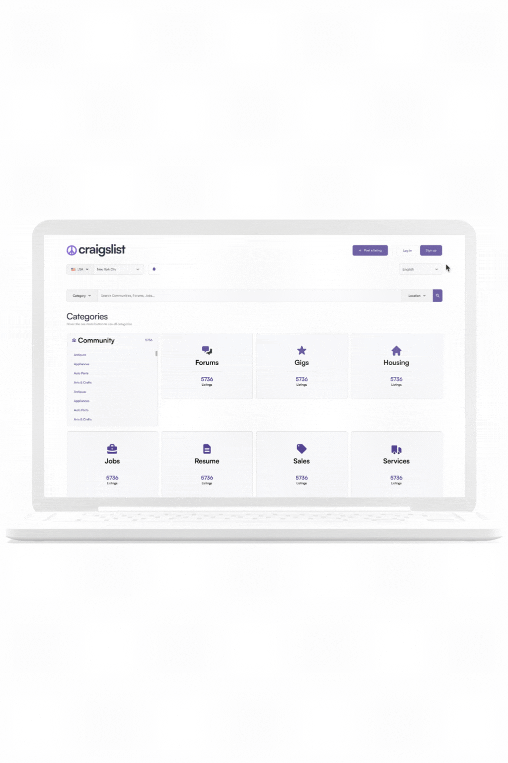
However after some careful consideration we settled on cards that reflected the categories, and when hovered over the users would be able to see the subcategories. This in return made it easier on the users eyes and helped decrease some of that visual clutter on the home page.
initial wireframes of home screen
Once satisfied with our wireframes we worked on the mobile version and went on to finalize our changes to the website displayed below
Final Design
Final Design

Before and after of for sale screen

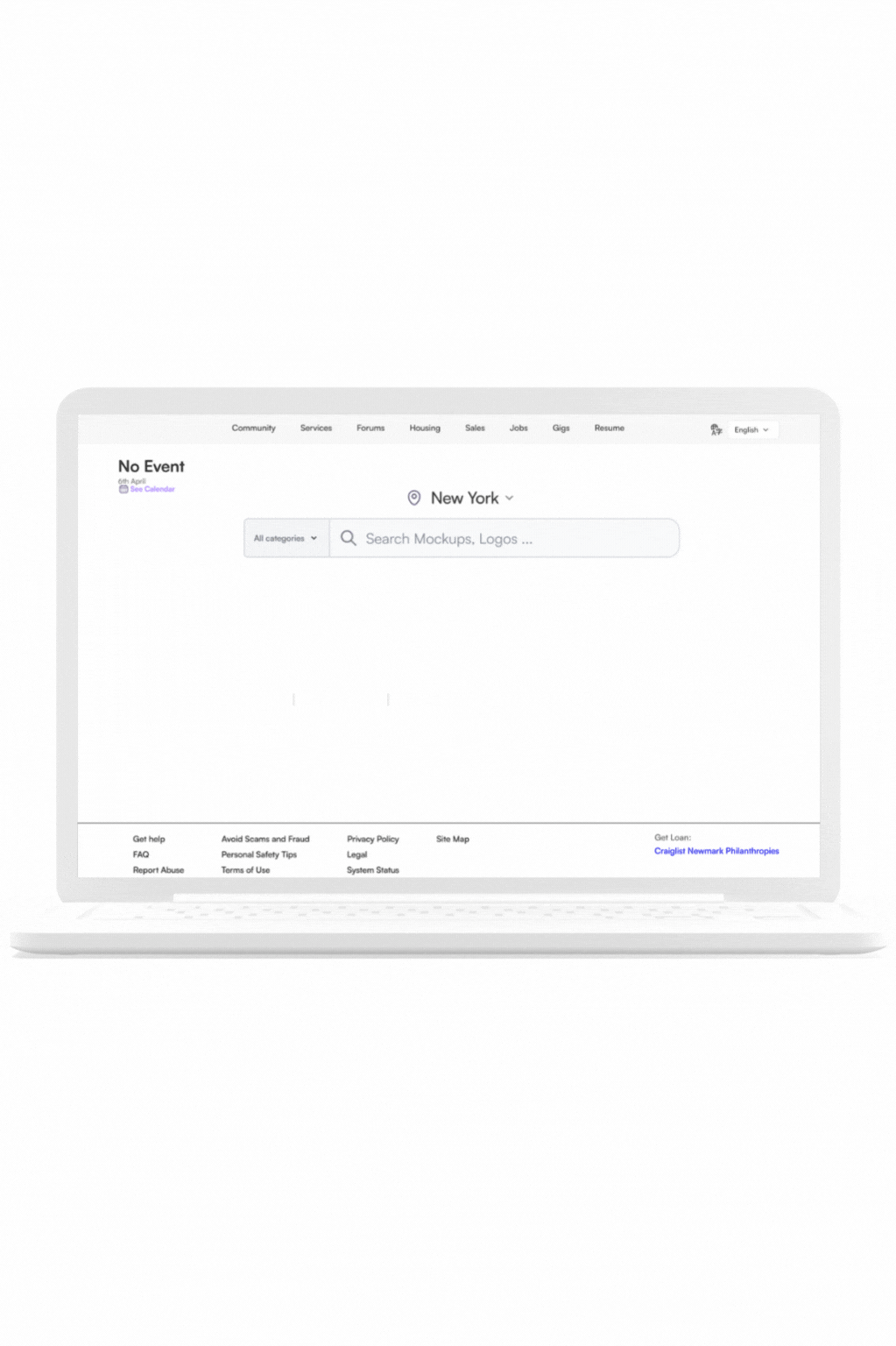
Before and after of home screen

Before and after of listing screen mobile
Style Guide

DESIGN EXPLANATIONStaying true to the brand
The goal of this redesign app was centered around staying true to Craigslist's brand identity, which is based on straightforwardness and simplicity. Our team avoided cluttering the website with unnecessary elements to ensure easy navigation and a focus on listings and information.
prototype of final design
Final Thoughts
Final Thoughts
Takeaways
Through this redesign journey I learned about the benefits of working with a team and how much insight other individuals can offer in the design process. Being able to work as a team for a competition to redesign craigslist was such an exciting experience. Hearing everyone's perspective and being able to collectively make decisions and put our heads together to solve the problem made getting to the solution feel so much more enriching. Furthermore I learned that there’s beauty in simplicity and sometimes that’s exactly what a user needs in order to get to where they want to be.
Next steps
01
Redesign the ad posting flow for users
02
Test redesign for accessibility in order to ensure users are able to comfortably navigate
03
Implement a review system so users are able to feel more confident about the ad postings.