Crafting a clothing retail experience to address ,and reduce the friction users face when shopping online.
Role
Sole UX/UI Designer
Duration
4 Weeks
Tools
Figma, FigJam, Photoshop

👉 Overview 👈
The clothing industry has been seen a continuous shift towards online shopping, as a result there is a growing need for clothing apps that offer users with a holistic experience.
Solus is a retail platform that offers trendy clothing at an affordable price. Solus's goal is to provide users with a stress free way of purchasing items they can feel confident in.
Problem
Trendy fashion apps typically have difficult systems for browsing through available products, visually cluttered design, and tedious checkout processes.
Goal
Create a user friendly app that is easy to navigate and provides users with a smooth shopping experience, while displaying products in a visually compelling way.

Research
Research
DESK RESEARCHGetting to know the industry
In order to properly understand users current online shopping experience, I first did my own digging through different research articles on the topic of the challenges present in the e-commerce industry.
While reading through different studies I found interesting data that emphasized that users want to be able to navigate to their desired product with minimal effort.
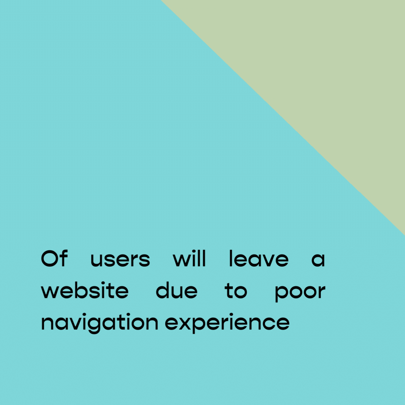
data from study on ecommerce
competitive auditWho are we up against?
With the research in mind I took it a step further and analyzed 4 popular competitors. After studying the competitors I found that a majority of them sacrificed a user friendly experience in order to convey a specific branding image.
A majority of the competitors current app were quite difficult to navigate, and while browsing I found myself straining my eyes due to the small text size.


“The whole point of online shopping is that it’s supposed to be easy and comfortable”
user interviewsTalking to frequent online shoppers
Before getting started on my design work, I wanted to get a better sense of what people were looking for when they shopped online. I found that a majority of users see online shopping as a way to relax and have some fun. However, a lot of users also mentioned that sometimes their favorite applications can be overwhelming and confusing. As a result they might end up taking a break or abandoning their cart altogether.

responses from user interviews
Pain points
Motivation
Online shoppers are motivated by the feelings of joy they experience while shopping, however when this experience is made difficult they are at risk of abandoning their cart
Navigation
Shopping apps typically have very busy designs which can cause the user to get confused.
Visibility
Small text and buttons on shopping apps make it difficult for users to select products and can in return cause the user to make a mistake
Design Goals
Design Goals
key insightsBased on the research gathered, I kept in mind some details
Make sure that browsing is simple and easy to navigate, so that users don't get overwhelmed and give up.
Create a checkout process that is smooth and frictionless, so that users can complete their purchase without any hassles.
Keep users interested and engaged by creating a visually attractive site and offering curated recommendations to give users a personalized experience.

empathy map based on user responses
User flow
I created a user flow diagram to map out the steps of the user taken to complete the main goal of the app

“As a user I want to be able to browse and purchase products from Solus"
Design Exploration
Design Exploration
sketchingExploring potential designs
I started with some basic sketches to structure the layout of the application. I wanted users to be able to easily review information in their cart and while filling in their personal details.

initial sketches of main screens
wireframesGoing digital
Initially while coming up with the layout of the application I decided after some feedback that it would be best to split up the checkout process and the user cart in order to not overwhelm the user.
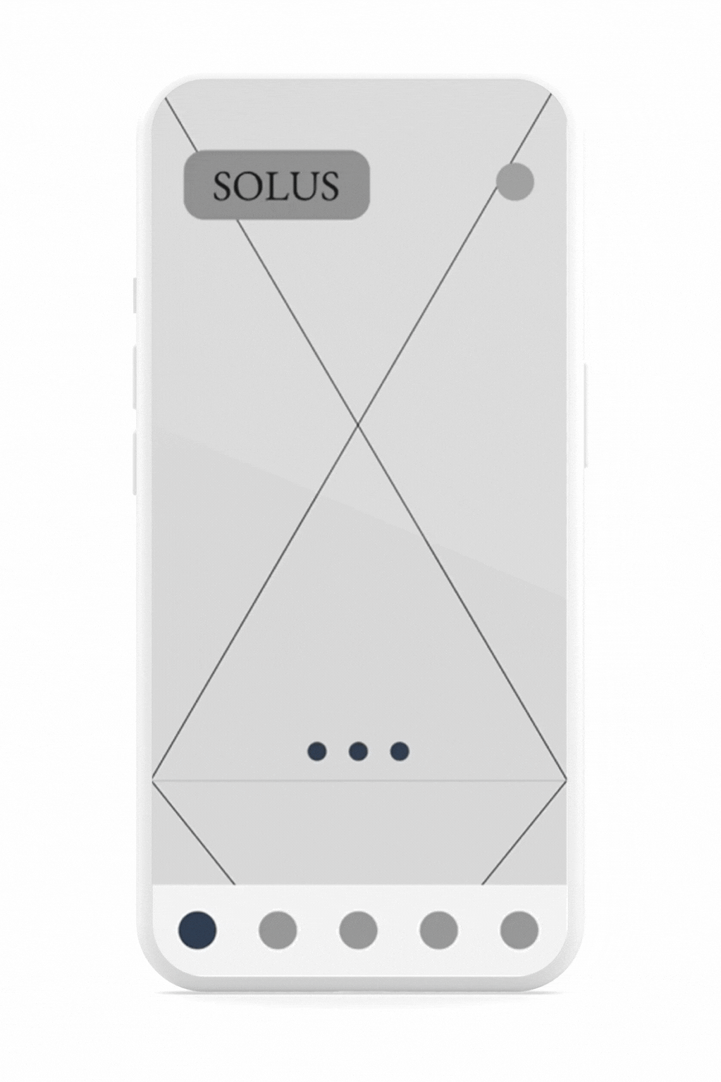
wireframes of main screens
After wireframing the initial designs of the product I prepared a low fidelity prototype to begin testing
User Testing
User Testing
usability studyBeginning the testing process
With the low fidelity prototype complete I begun to prepare for a round of usability testing. In order to test the effectiveness of the current design, users were given a series of tasks to complete over an unmoderated recorded zoom session.

5
Participants
18-40
Ages
30
Minute sessions
Study goals
01
Are there any areas of the current app functionality that can better enhanced the user experience?
02
Observe if users are able to complete the user journey. Were there any mistakes or confusion in navigating the app? If so, was the user able to recover?
03
Do users feel like there are any features that the app is currently missing?
usability study findingsCompiling the feedback from the usability study
Based on the data gathered from the feedback, I noted that users reported that navigation was confusing and non-intuitive, causing them to get lost in the menus and pages. This made it difficult for users to find the right options and complete tasks efficiently. I decided to restructure the layout of the app and also implement certain features that could lead to a better user experience.
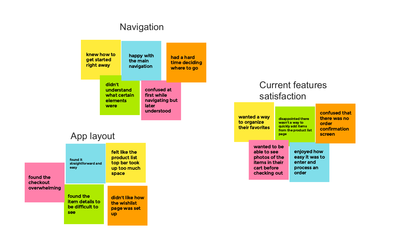
affinity mapping with user data
With the feedback from the participants I made the necessary changes to the app displayed below.
Final Design
Final Design

Before and after study of favorites screen

Before and after study of checkout screen
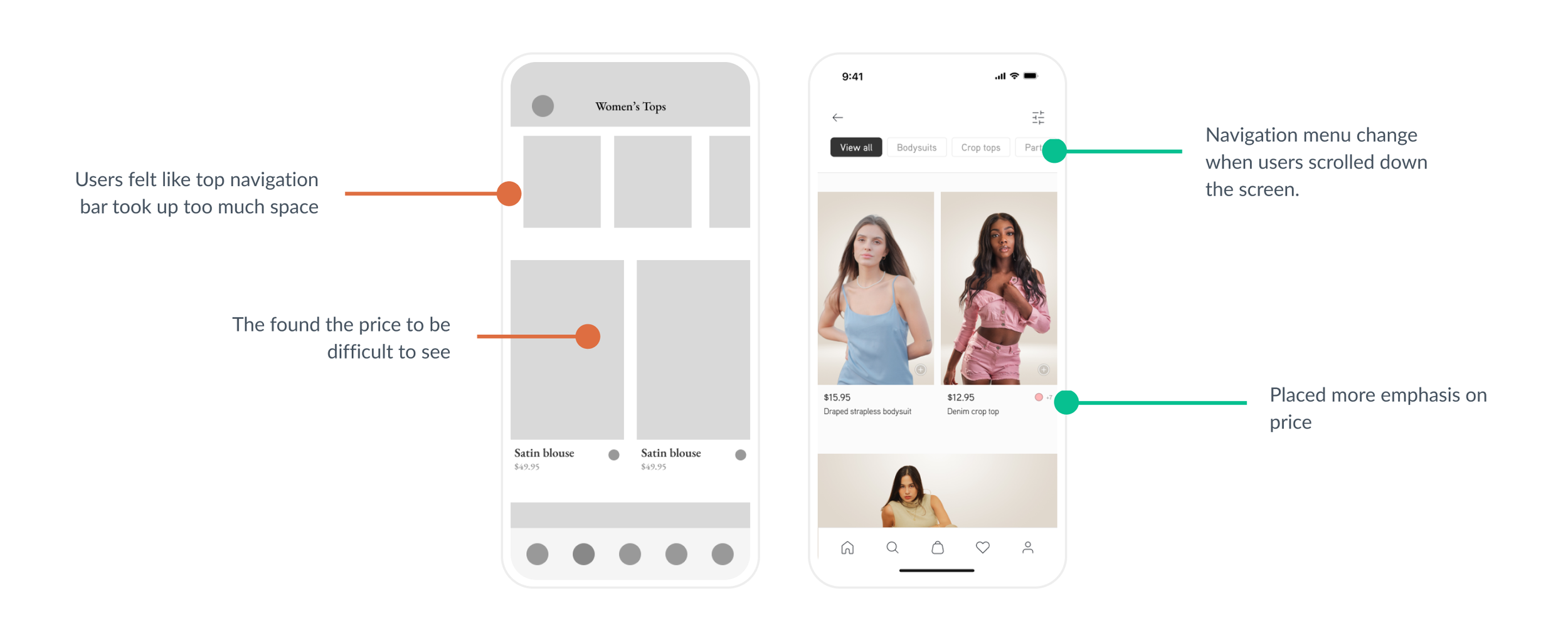
Before and after study of listed items screen
Style Guide
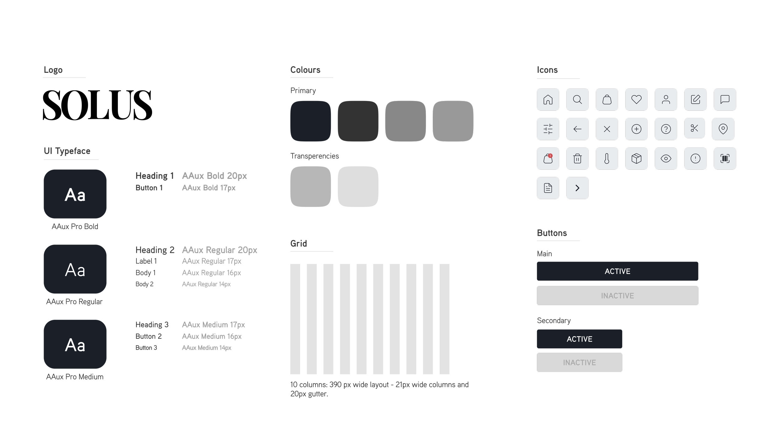
DESIGN EXPLANATIONThe importance of minimalism
Following several iterations, I designed the final screens with the aim of providing users with a clean, luxurious look that keeps users engaged and relaxed while satisfying their shopping needs. It was important for me to establish a design that reinforced trust between the user and the brand.
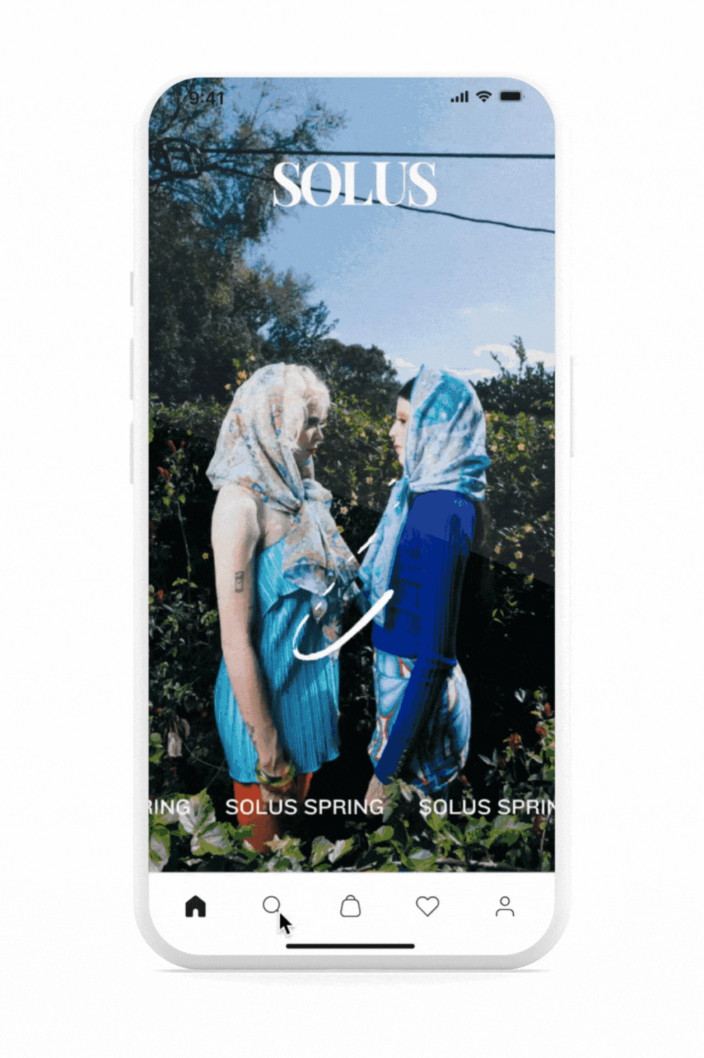
final prototype of user jouney
Final Thoughts
Final Thoughts
Takeaways
While working on SOLUS I learned about the ecommerce industry and how users feel while interacting with such apps. During the beginning of this process I had a lot of ideas as to how to create an engaging shopping platform, however through my research I learned that it’s not necessarily about reinventing the wheel. Instead it's about taking what works and improving on what's causing the user frustration.
Next steps
01
Creating a more personalized shopping experience through additional curated ads for each user.
02
Continue to look for ways to make the app accessible by testing screen readers, and eye tracking software.
03
Expand on the review system for the app.